How I measure racehorse performance across 11 countries and one million races.
I'm about to launch mrworldpool.com — a premium horse racing analytics platform I've built from scratch with plenty of help from AI along the way. This article explains the core of the product: the rating. What it measures, how it works, and the 20-year journey behind it.

I've spent the better part of 20 years building something that most people in my life know surprisingly little about. It started as a hobby when I was eighteen — making speed figures for Scandinavian horse racing with my younger brother — and has grown into Mr. World Pool, a platform that rates racehorses across eleven countries using methods I've developed and refined over one million race results.
I recently wrote this piece to explain what these ratings actually are, how they work, and the history behind them. It's part explainer, part personal history, and part love letter to a craft that has consumed a significant portion of my adult life.
If you've ever wondered what I actually do when I say I "work with horse racing data" – this is it.
You can read the full story here: https://www.mrworldpool.com/learn

Understanding the Rating
The central problem in handicapping
Thoroughbred racehorses compete across different tracks, distances, surfaces and conditions. The weight they carry changes from race to race. The competition changes. The ground changes. They drift in and out of form like any athlete. Making sense of all this — figuring out how fast a horse actually ran in a given race, relative to everything else — is the central problem in handicapping.
In horse racing, the tools for solving it go by many names. Speed figures, performance ratings, speed ratings, performance figures. For me they are all the same thing — an attempt to quantify and standardise the merit of a performance so that it can be compared against any other performance. You are trying to answer the question of "How well did this horse run today?" with a single number that answers that question, accounting for everything we can account for, and with a number you can compare across tracks, across distances, across countries and across surfaces. A 120 at Ascot and a 120 at Sha Tin and a 120 at Meydan mean the same thing.
Getting there is harder than it sounds. Especially when raw times can vary by ten seconds from one day to the next on the same track, depending on how much moisture is in the ground. This is the story of how we got there. It's part explainer, part personal history, and part love letter to a craft that has consumed a significant portion of my adult life.
A Brief History of Speed Figures
The first published work on performance ratings dates back to 1936, when E.W. Donaldson released "Consistent Handicapping Profits." With it, he laid the foundation for a long tradition of competing schools and philosophies in the art of making speed figures — particularly in America.
The breakthrough moment came in 1992, when Andy Beyer's speed figures were adopted by the Daily Racing Form and became available to every horseplayer in the country. The Beyer Speed Figure is elegant in its simplicity. You take the final time for each horse, adjust for track speed using a set of expected par times for each class and distance, and express the result as a number. A first approximation of how fast a horse actually ran — and for millions of horseplayers, a revolution.
Running parallel to Beyer — and in some ways predating him — was Len Ragozin, a Harvard graduate whose career in journalism was cut short by the FBI during the McCarthy era. Ragozin turned to his father Harry's hobby of using mathematics to quantify racehorses. Ragozin understood that factors like riding weight and the extra distance horses cover when racing wide through turns — what the Americans call "ground loss" — could and should be incorporated into the figures. His "Sheets" became a premium product for serious bettors. But Ragozin also had blind spots. His treatment of track speed was, frankly, strange: he assumed that track conditions didn't change during a race day unless there was an obvious cause like a rainstorm, and he'd carry the same track variant across from one day to the next if the weather hadn't changed. Anyone who has worked with ratings knows this is wrong. Track speed changes constantly — with moisture, with maintenance, with the number of hooves that have chewed up the surface.
It was Jerry Brown, a former Ragozin employee, who built on these foundations to create Thoro-Graph — and in many ways, Thoro-Graph remains my closest relative in this world. Brown saw the problems with Ragozin's approach and introduced what I consider the most important innovation in figure making: the idea that the clock alone isn't always enough, and that there are additional data points available — things you already know about the horses in a race — that can help you arrive at a more accurate picture of what actually happened. That insight changed everything for me.
Where I Came From
I’ve been making my own performance figures since I was eighteen years old — nearly 20 years ago now. I started in Norway at my home track, then quickly expanded to Sweden, Denmark, Meydan in Dubai, Hong Kong, and eventually the global markets I cover today.
My first love, however, was American racing. I discovered the sport through Thoro-Graph’s form sheets via a collaboration they had with Betfair. At the time, they offered their data for free and later at a discount, and I was hooked. Before this, my only exposure to racing was a trip to the Hipodromo in Mijas, Spain. It was our first trip abroad without parents, and we spent our time "wisely": drinking and gambling. We didn't understand the language or the sport; we just bet on a horse named "Mister Hans" because it was the name of my father. It lost, of course. I remember not liking too much the feeling of being the stupidest person in the crowd that day.
The following summer, we visited Øvrevoll for the Norwegian Derby. This time, we actually studied the basic form. We circled jockeys we liked — Lennart Hammer-Hansen made a big impression — and we actually made a small score. It felt huge. That was the spark that turned curiosity into a serious (and slightly obsessive) pursuit.
I started skipping school — at least the early hours of it — because I was more interested in the evening racing from U.S. tracks like Mountaineer, Penn National, Charles Town, and Delta Downs. In my time zone, they started at 1 AM. With unlimited access to form, I became adept at "speed handicapping" multiple tracks at once, watching low-resolution ESPN streams in tiny windows via VPN. I must have handicapped and watched tens of thousands of races that year alone. But I did manage to finish school — that part was never really in danger. I even did pretty well, considering most classes before lunch in my final year lost out to the night racing overseas. I attribute that to my very strict hierarchy of priorities: Racing, then Sleep, then School. This system ensured that when I finally did show up after lunch, I was well-rested and full of heartfelt enthusiasm for whatever subject was on the menu. And really, what tired, overworked teacher can refuse a student like that?
I devoured everything: Beyer’s methodology, Ragozin’s philosophy, and every book available. I even tracked down an obscure DVD containing six hours of panel debates on handicapping from a venue in Las Vegas, featuring experts whose names I would follow for years. In those early days, I spent thousands of hours on the legendary Thoro-Graph message board, quietly digging through classic archives. It was only years later, as my confidence grew, that I’d emerge as "Furious Pete"—a character known for stirring up more than one controversy. Those debates taught me a priceless lesson: if you can’t defend your views under fire, you probably shouldn't hold them. It was the best education a young figure maker could ask for — even if my mother might have preferred a more traditional route.
After that first experience at the Norwegian Derby, I wanted to explore my local racing in depth. However, I ran into a wall. Coming from my "romance" with US racing, I was accustomed to sophisticated, data-rich products like Thoro-Graph and DRF Formulator. In Norway, all you got (and still get) was a basic racecard with almost no information—just five rows of recent form, a finishing position, and no statistics or speed ratings to speak of.
Cocky and determined, I decided I would simply build the form I wanted myself.
The year between school and university was spent working as a mailman, and my days were a study in "shifting modes." I was the world’s most polite gentleman when running up to a porch to hand-deliver mail to a waiting widow; I’d offer a quick smile and a friendly standard greeting, keeping everyone happy without ever breaking my stride. But the moment I turned to run back to the mail truck, I’d shift instantly into a deep, contemplative "calculator mode."
I spent weeks like this, my mind racing to solve the problems I’d encountered the night before while building my figures from scratch. I didn't have a database. I didn't have official par times, time charts, or ground loss data. I had nothing but spreadsheets, notepads, a calculator, and an obsession.
Once a week during the racing season, I’d deliver the official race form, and I quickly realized I had three subscribers on my route who followed the horses. On those days, I’d time my lunch break perfectly so I could catch a sneak peek at their racing form before it hit the mailbox. I even wore a Daily Racing Form cap on my route—a humble attempt at creating some serendipity—but I never actually got to talk to any of them.
Eventually, I solved it. For over ten years, my younger brother and I made those figures together. His job was to study the race replays and record the position of every horse through every turn—the raw data needed to calculate ground loss. My job was to punch in the data and turn it into ratings. We believed, as many do, that accounting for ground loss was the most accurate way to make figures. One path out from the rail through a turn costs a horse roughly one length of extra distance. That’s geometry—or so we believed. The math is straightforward, but turning it into a fair measure of what a performance was actually worth? That turned out to be much harder.
The Ground Loss Problem
Here’s what I noticed: you get a lot of bloated figures for horses that race wide. A horse goes four wide through both turns, gets a generous ground loss credit, and suddenly posts an enormous number. Meanwhile, the horse that saved ground on the rail and actually won the race gets no credit.
The issue is that not all ground loss is created equal. There is "true" ground loss — sitting outside a leader in a wicked pace, burning energy to keep up while covering more ground. That is costly, and any credit those horses get, they deserve. But there is also "false" ground loss. If the pace is slow and everyone is coasting, being a path or two wider costs you almost nothing. Worse still, if the track has a bias that favors the outside, you end up inflating figures for horses that actually had the best trip.
I saw this problem again and again. The wide runners got huge numbers, while the inside runners were punished. Yet, when you tracked those wide runners forward, they rarely replicated those figures — unless they happened to be just as wide next time. The numbers looked spectacular on paper, but they didn't predict anything. Some horses simply prefer daylight; they’ll go wide from any stall and do it every time they run well. For these horses, ground loss credits aren't accounting for a penalty — they’re counting a preference.
When I was eventually left alone with the venture, dropping ground loss from the algorithm was an easy decision. I still note when a horse has raced genuinely wide, and I’ll upgrade them "in my head" when handicapping, but it’s no longer in the math. The benefit was enormous: without the labor-intensive video work, I could think bigger. I could look at Hong Kong, Japan, Australia, the Middle East, and all of Europe. It was the best decision I ever made.
How the Ratings Work
I’ll be upfront: some of this is the secret sauce, and it’s going to stay that way. But I can share the principles that make this approach different.
- Time is the Anchor, Not the Story: The first ingredient is always the race time. But a raw time means almost nothing on its own; a fast time at Epsom is a different animal than a fast time at Ascot. The system uses carefully calibrated standard times for every track, distance, and surface—refined over 20 years. Just as important as the winning time are the distances between horses at the finish; they reveal the strength of each performance relative to the field.
- Track Speed is Everything: A track can be seconds different between Monday and Wednesday, even if the official going remains "Good." My system looks at each race day as a whole to identify tendencies. While one horse can produce a freak performance, it’s rare for an entire field to collectively run way above or below their level. That variance calculation is the backbone of the rating.
- Weight is Baked In: A horse carrying 60kg that runs the same time as a horse carrying 54kg has performed better. The relationship between weight and performance is well-established, but since its effect varies by distance and surface, I don’t reduce it to a static number. It’s not perfect, but it’s far better than ignoring it.
- The "Whole Race" Principle: This is a rule I will never break: Every horse in a race gets the same adjustment. If you want to adjust one horse up by two points, you must adjust the entire field. The process is about finding the best fit for the whole race, not making individual horses "look right."
- Turf and Dirt are Different Sports: I treat turf and dirt form as entirely separate entities. A turf rating never influences a dirt rating. While I group different dirt and all-weather surfaces together for practicality, the data supports keeping them strictly isolated from turf.
Some figure makers use only the clock. Some use wind data. Some "break" out races, others never do. Some adjust ratings for pace, some don't. Everyone thinks their method is best. The truth is that every method has flaws. My goal was to find the most robust method across the widest range of racing cultures—from a Tuesday handicap at Wolverhampton to the Dubai World Cup. I wouldn't trade my ratings for anyone’s.
On "New tops" and Philosophy
Much of figure making comes down to deciding how much you tolerate "new peaks" — or "tops," as some call them — and how rigid you are in your methodology. Some figure makers are famously inflexible; they trust their calculations absolutely and will print enormous career-bests if that’s where the numbers land, even when half the field shows "peaks" on the same afternoon. Ragozin was known for this stubbornness. While it sounds principled, in practice it often means accepting results that don't make sense rather than questioning if something upstream went wrong.
I am more practically oriented — and likely more conservative than most. When I see a race where the figures suggest several horses all ran career-bests simultaneously, I look for an explanation — track speed, pace bias, or freak conditions — rather than simply accepting six breakthroughs on the same card.
In my experience, there are many more legitimate reasons for a horse to underperform (bad trip, wrong ground, illness, poor ride, track bias, not ready) than there are for a horse to suddenly outperform its established level. A genuine peak needs to be earned. This philosophy produces ratings that are more predictive; spectacular peaks that are never repeated aren't useful if you’re trying to figure out what a horse will run next week.
The Algorithm and the Scale
When I decided to go "full global" with my ratings, I had to transform all these years of expert knowledge into a robust algorithm. It’s impossible to manually review over a million races one by one, so the system had to be sophisticated enough to handle everything from a Tuesday handicap at Wolverhampton to the Dubai World Cup, and then just flag the weird ones for manual review.
After hundreds of iterations, I arrived at a model that scales across eleven countries: Great Britain, Ireland, Hong Kong, the UAE, Norway, Sweden, Denmark, Germany, Australia, France and Japan.
To give you a sense of the scale, here is how the numbers look in practice (based on UK and Irish racing from 2023 onwards):

A typical Class 5 runner averages around 100. A Group 1 winner averages 145, and the very best performances push past 155. At the bottom of the scale, the weakest races in Scandinavian racing might produce winning ratings in the low 80s.
One length is worth about a point at route distances.
Using the Ratings
"The Handicapper"-section
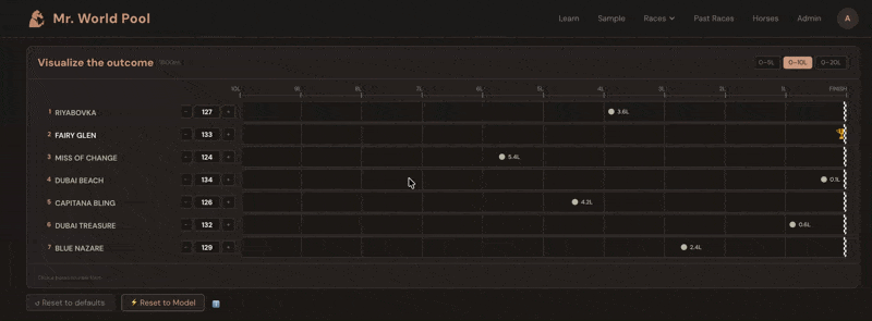
The ratings come alive in the Handicapper section of each racecard on mrworldpool.com. For each horse, the Expected Rating module translates past performances into projected beaten distances. You don't just see that Horse A is rated 118 and Horse B is rated 125 — you see, visually, that B is expected to finish roughly three and a half lengths clear, all else being equal.
The whole exercise becomes about one question: what does this horse run today? You look at the form. The conditions. The trainer pattern, the jockey booking, the surface, the trip. You form a view — maybe you think Horse A will improve three points on its last run, maybe you think Horse C will bounce after a big effort. Then you check: if they run to that figure, are they competitive? The Handicapper shows you instantly.
Over time, this is how you develop a feel for what the numbers mean. You start to know what 110 looks like, what 125 looks like, what it takes to win at a given level on a given day. The numbers stop being abstract and start being a language you speak.
A machine-learning addition
Built into the Handicapper section on mrworldpool.com, I have deployed a machine learning model trained on over one million race results. It combines nearly 400 data points per horse—recent form, track and surface preferences, going and distance aptitude, trainer/jockey stats, gate position, and more. Because horses naturally regress from peak figures, the Expected Rating will often appear lower than a horse’s recent "best" form. This is statistically correct, not a flaw. The real value lies in the relative differences between horses.
The model sets the baseline; your judgment determines who beats it.

The Ultimate Challenge
Horse racing is at its best when treated as a high-stakes problem-solving exercise — developing your own theories and testing them with immediate validation, only for a new puzzle to arise the moment the horses cross the wire.
My hope is that Mr. World Pool can lower the barrier to entry for new players while still rewarding expert pattern-recognizers with endless layers of data to analyze. I’ve been doing this for 20 years, and I’m still usually the youngest guy in the room. This platform is my attempt to change that. It offers the quickest path for a newcomer to reach expert-level handicapping skills, while giving seasoned amateurs the professional-grade tools they need to compete in what has become a hyper-competitive, data-intensive betting market.
Because in the end, it’s not just about the amount of data; it’s about the quality of that data. To achieve true quality in ratings, you need more than just raw processing power — you need a deep-seated love and understanding of the craft.
Even the legendary pioneers of computer-based betting didn't necessarily prioritize that connection. Bill Benter famously admitted that, for a long time, the only horse he could actually name was one that had irritated him by being a statistical anomaly in his model. For the quantitative giants, horses were just rows in a database.
This is my attempt to bridge that gap.
A Note on Ground Loss
Even though ground loss isn't in the algorithm anymore, it's worth being aware of. If a horse raced genuinely wide — not the cheap kind where the pace was slow and it cost nothing, but truly wide in a strongly-run race — upgrade them a bit in your handicapping. If you think they'll end up wide again, factor that in. Look at the gate draw. Check the track statistics. Look for the wide-running flags in the form.
The old rule of thumb is roughly one length of ground loss per path out from the rail per turn. It quickly adds up.
See the Ratings in Action
The rating system behind Mr. World Pool is the culmination of 20 years of development, spanning 11 countries and over one million race results. It is the foundation of everything we do - and now you can test it for yourself.
How to get started:
- Explore the Free Demo: See exactly how a full racecard looks on our sample page here.
- Try the Full Product: For a limited time during our launch period, all new accounts receive 3 free credits. These can be used on any race day of your choice, giving you full access to live racecards, interactive handicapping tools, and our machine-learning predictions.
Are you ready to see horse racing through a different lens?
Create your account and claim your 3 credits at mrworldpool.com